The Grid
Design Studios layouts are built on a responsive, modular grid system—rooted in the timeless principles of graphic design—to bring clarity, cohesion, and impact to every composition. These grid layouts adapt seamlessly across applications, maintaining visual balance and cohesion in every medium.
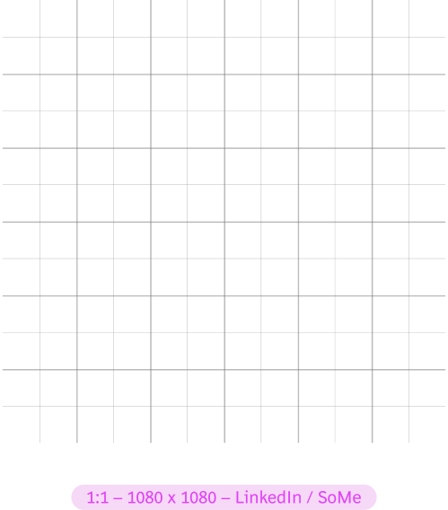
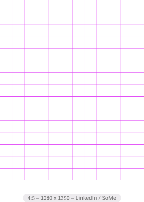
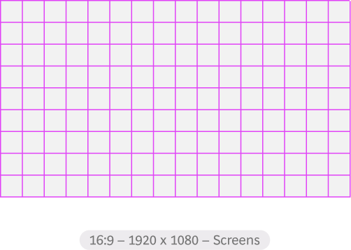
MARGINS & COLUMNS
To create our margins, we take the 180 pixel grid, for finer adjustments it can be further broken down to the 90 pixel grid. This gives us a modular margin that scales proportionately across all application formats and sizes.
The outer columns and rows becomes our margins.
Note: In some extreme cases (very wide or very tall) applications, our margins may need to be adjusted manually for optical correctness
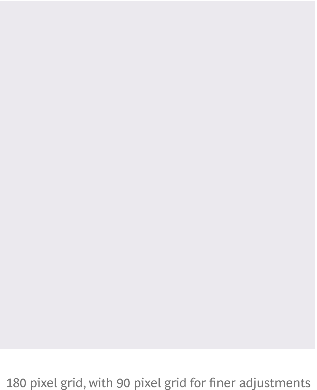
180 pixel grid, with 90 pixel grid for finer adjustments

The two outermost rows and columns
on each side become our margins.
DONT'S
Grids are a simple tool to create order. Changing them too much will create inconsistency.

✕ Don't make the logo too small.

✕ Don't change or over complicate the grid.
THE VISIBLE GRID
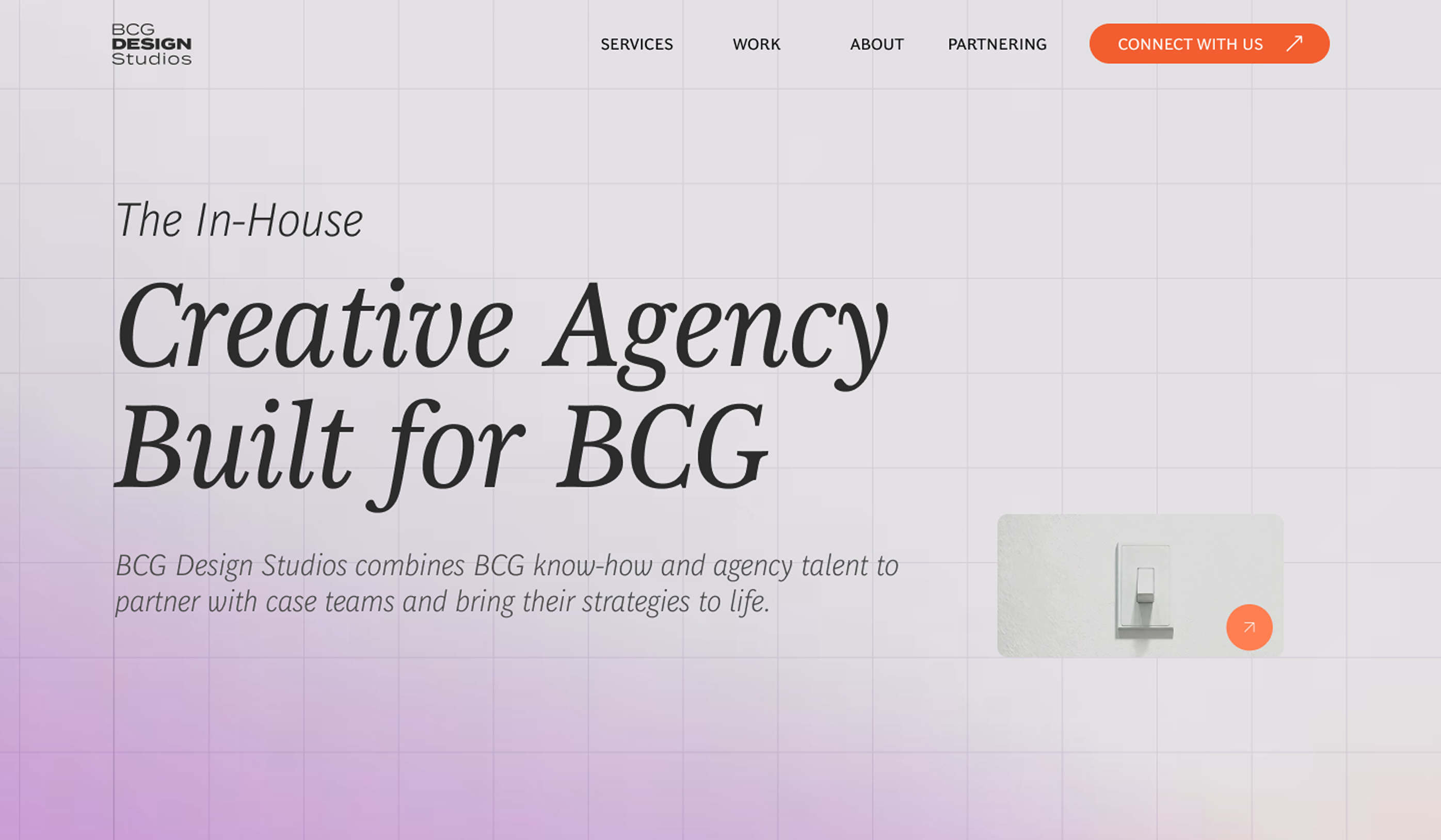
As a graphic element for our identity, we also make use of a visible grid system, applied only to our website and digital presence.
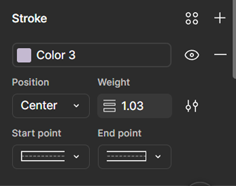
The visible grid follows a 1:1 square grid ratio, stroke width 1.03 and Color 3 (#C4B9D1) from our palette.
Download Grid & Layout Resources
Access our grid guides and layouts across application mediums.