Imagery
Our graphic expressions are more than just visuals; they're a symphony of elements harmonizing to convey our brand's essence. Each shape, line, and texture is thoughtfully chosen to evoke emotion, spark curiosity, and leave a lasting impression. From bold strokes to delicate details, every element contributes to our unique visual language.
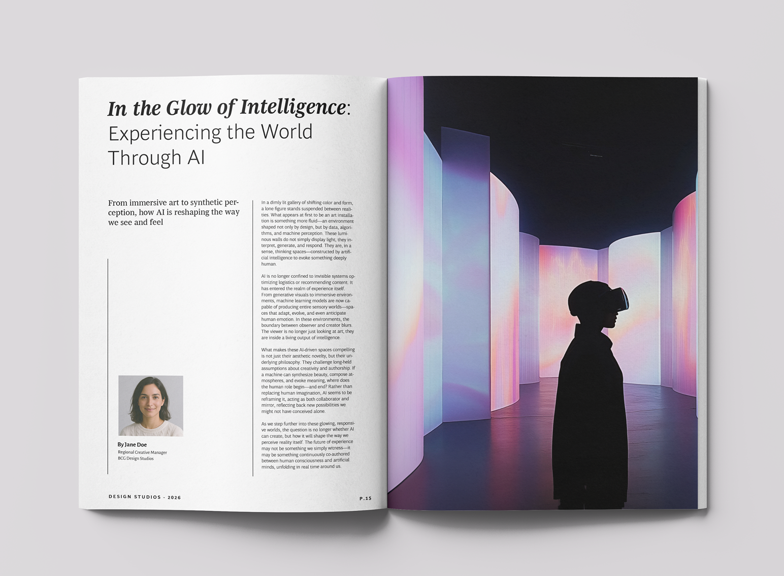
Photography
Principles
All of our photography should aim to feel as true-to-life as possible. Keep the following style principles in mind:
Natural
Capture the scene in soft, diffused light, avoiding harsh shadows that can obscure details. Opt for a time of day when the light is naturally gentle, or use a diffuser to soften direct sunlight.
Candid
Capture authentic moments through candid photography, minimizing posed shots that appear unnatural. Prioritize genuine emotions and interactions to create a more compelling visual narrative.
Moments
Capturing 'moments', snapshots in time which show the real-life experience of work, both in the design and business context and across industry.
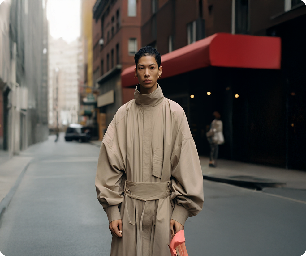

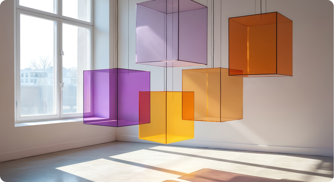
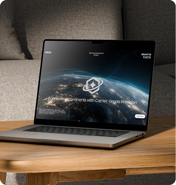

Product & Work
Showcase
All of our photography should aim to feel as true-to-life as possible. Keep the following style principles in mind:
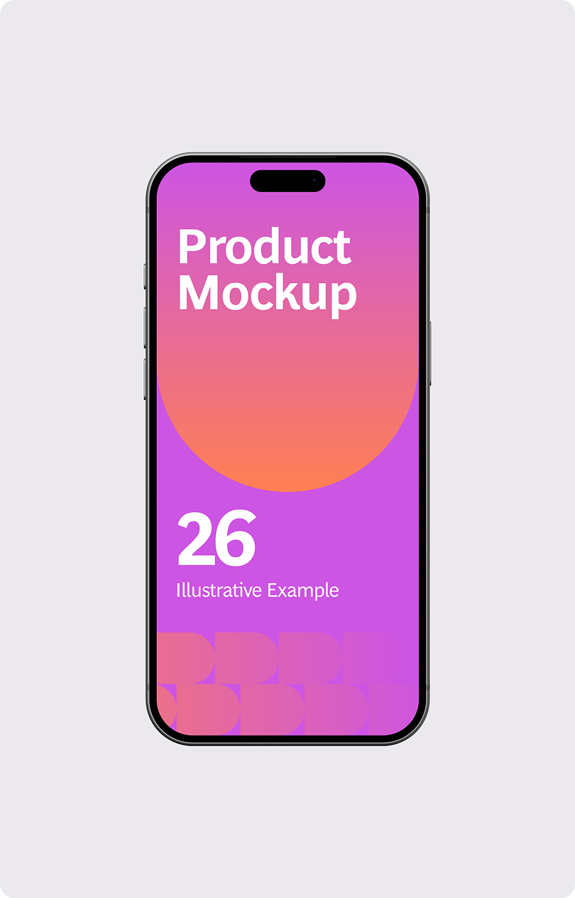



People
All of our photography should aim to feel as true-to-life as possible. Keep the following style principles in mind:





Spatial &
Contextual
Our photography should feel authentic and natural. Keep these style principles in mind:

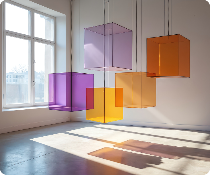
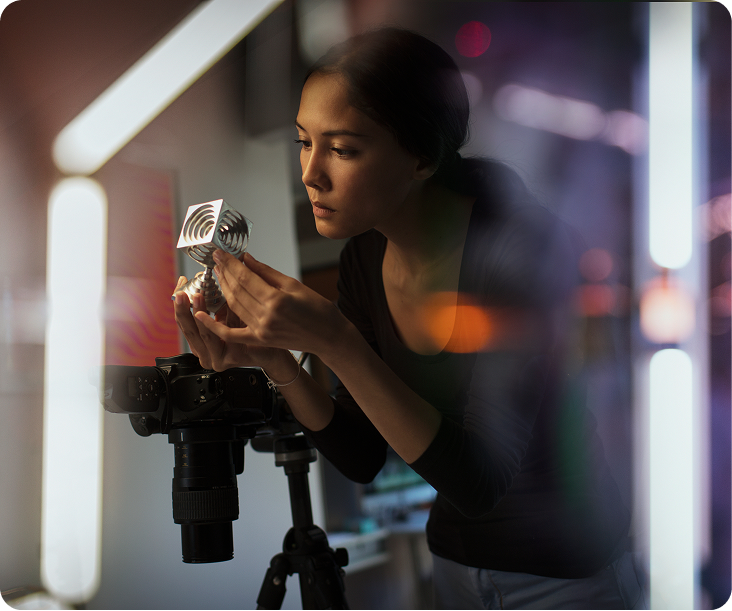
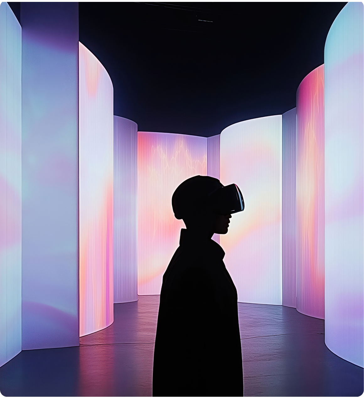
Incorrect Photography Usage

Do not use overly posed or staged images: Opt for candid shots that capture genuine moments and emotions. Prioritize real-life scenarios to create a relatable visual experience.

Do not use images with excessive filters or artificial enhancements: Strive for authenticity by avoiding heavily edited visuals. Instead, focus on capturing the natural beauty of the subject.

Do not use collage: Collages can appear cluttered and lack focus, distracting from the message and diluting the brand's impact. Instead, use single, powerful images.
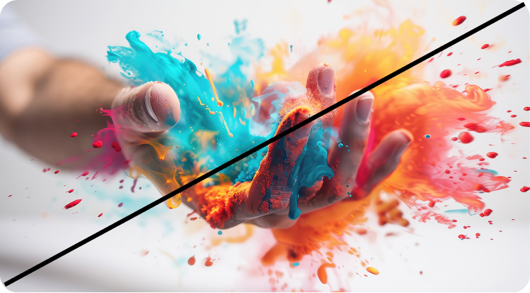
Do not use cliché images: These images often lack authenticity and fail to resonate with audiences, diminishing the brand's credibility and memorability.

Avoid very obvious AI-generated images: Be mindful of the quality of AI-generated visuals. Very often results lack of emotional depth and a sterile aesthetic, potentially alienating audiences and undermining the brand's credibility.
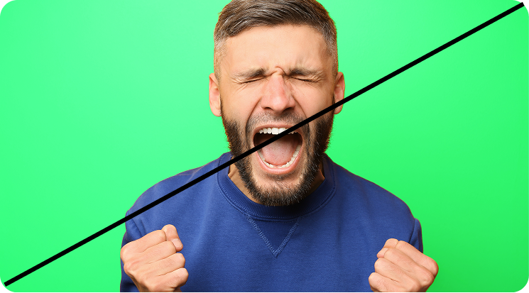
Avoid images that evoke negative emotions or clash with our brand's color identity: Ensure imagery aligns with our brand values and resonates positively with our audience.
3D & Abstract Artifacts
Abstracts 3D shapes can be used as an imagery resource, they are great tools to add visual weight and create a recognizable language, while staying pretty content agnostic. However please ensure you are only using compositions aligned with the examples below:
Matte Abstract Shapes
Matte 3D shapes with a subtle texture add visual interest. These fluid shapes maintain a sleek and simple aesthetic for a modern look.
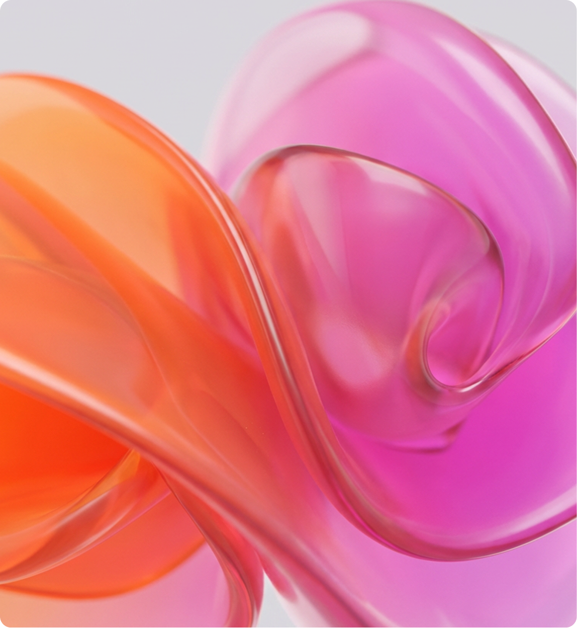
Glass Abstract Shapes
Alternatively we can also use glass-textured 3D images. These allow for a softer color balance, adding more light due to translucent materials. These can be naturally more fluid but they should always feel sleek and not too busy or complex.


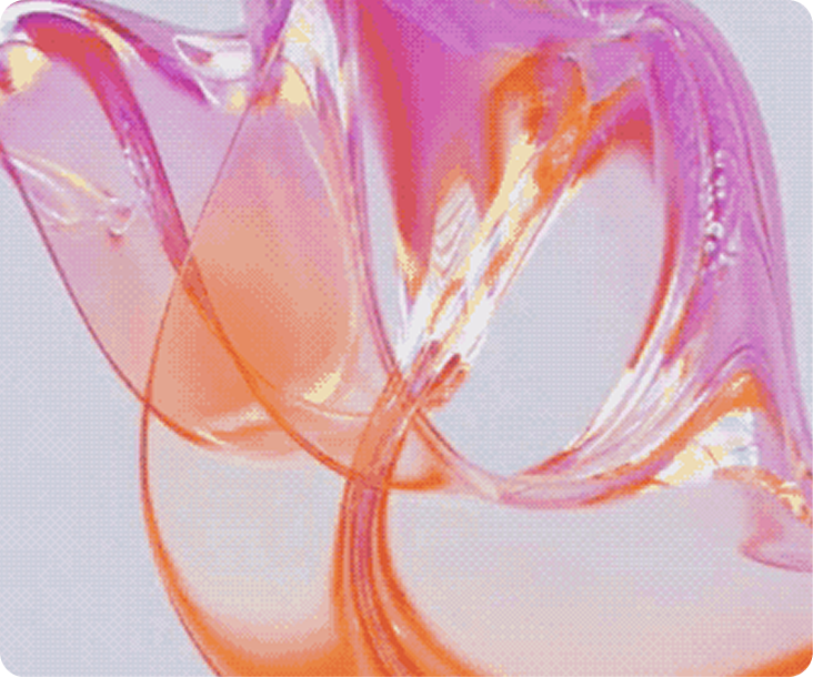
Incorrect Usage
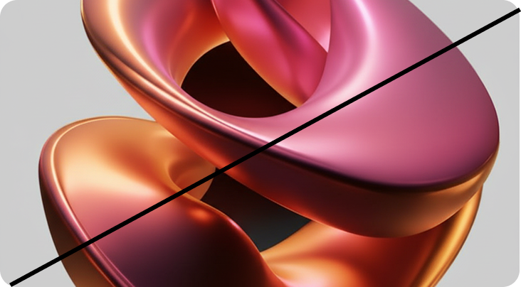
Do not use alternative textures beyond the ones established in these guidelines to ensure we maintain a consistent visual identity.
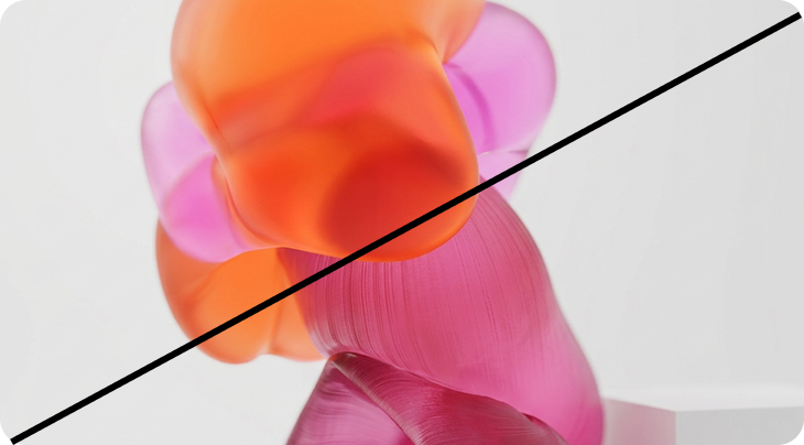
Do create static compositions that are confusing or unpleasant

Do not create compositions with textures and lighting that looks fake and outdated
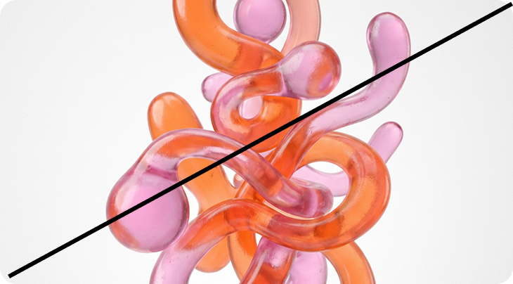
Do not create complex busy compositions
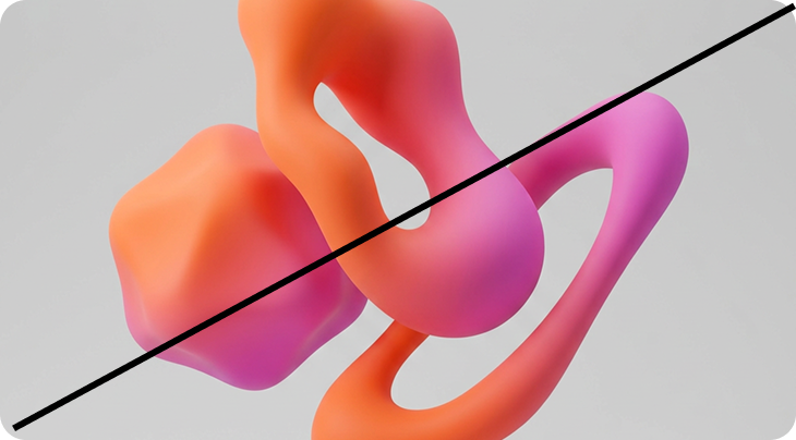
Do not use defined geometric forms unless there are specific need for it, and never as a background.

Do no use 3D compositions against dark or heavy backgrounds
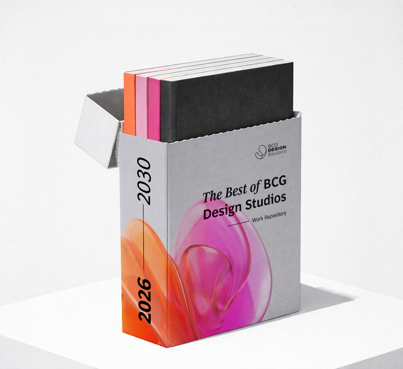
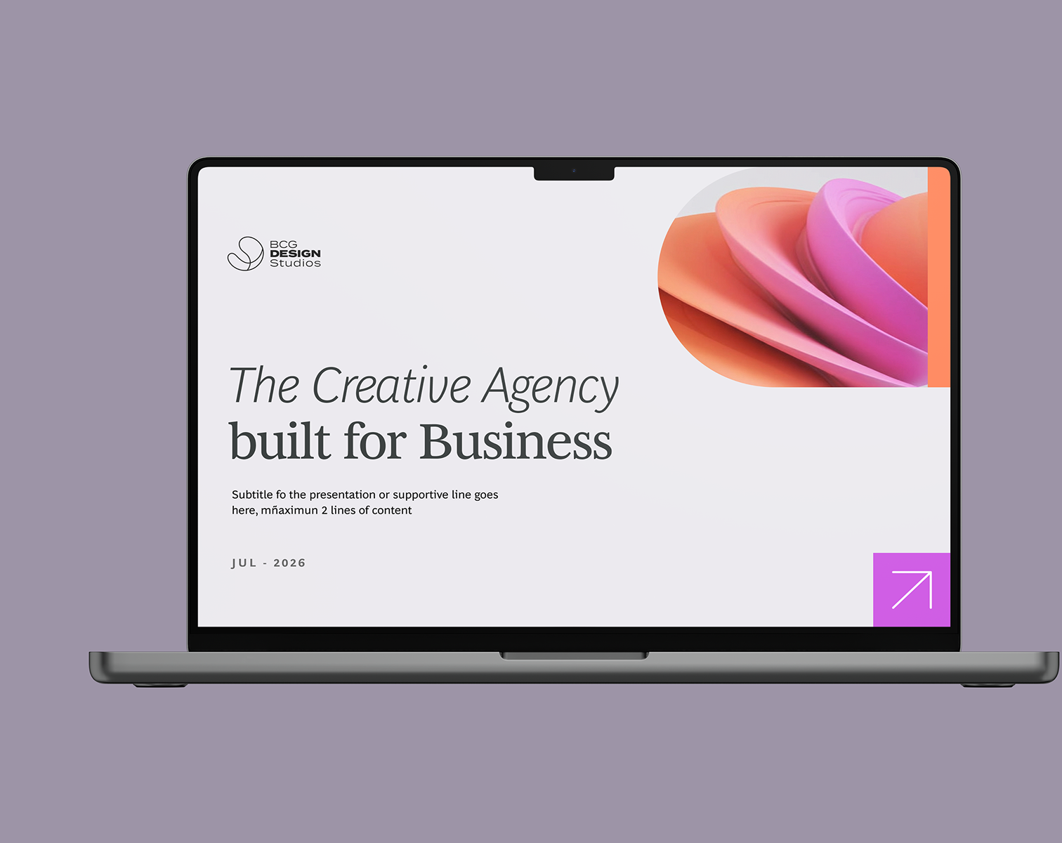
Download Resources
Access color swatches, palettes, and implementation guides