Illustration
Our illustrations take on many forms and ultimately have a job to do. They should always have a clear purpose, support content and guide a user to understand difficult concepts, products or services. Clear and simple illustrations help us provide meaningful engagement to our users.
Principles
All of our photography should aim to feel as true-to-life as possible. Keep the following style principles in mind:
Simple
Illustration should never work too hard or be burdened with too many ideas. They should always have one main focus / idea. Keeping an illustration simple and straightforward adds clarity. This simplicity helps guide viewers through complex concepts, stories or scenarios.
Diverse
We take great pride in our commitment to diversity and inclusion and Design Studios illustrations should be created in the same spirit. Gender, cultural and geographical diversity should always be considered when creating illustrations so that we strive for inclusion, representation and accessibility for all.
Delightful
Design Studios illustrations should carry a sense of wonder and delight. While illustrations are primarily used to explain or convey meaning, their delivery can be more lighthearted at times. Lightheartedness means adding a sense of fun that isn't overly humorous, but spirited, charming and appropriate for the situation.
Flat Style
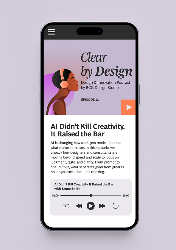
This style uses simple shapes, bright colors, and minimal details to create a clean and modern look. It's versatile and works well for various applications.






Flat Gradient Style
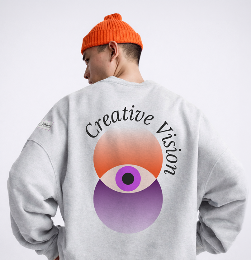
This style employs smooth gradients to introduce depth and a captivating three-dimensional feel to flat designs. It offers a modern and visually striking aesthetic, perfect for drawing attention and creating a memorable impact.

Flat Geometric Style
This style uses basic shapes like circles, squares, and triangles to create visually appealing images. It's often used to convey simplicity and clarity.

Incorrect Illustration Usage

Do not use collage: Collages can confuse the message of illustrations by introducing conflicting styles and visual noise.

Do not overly common corporate illustrations: Avoid using generic, overused images that don't add value or lack originality. Strive for unique and creative visuals.

Do no use hand drawn or outline illustrations: Avoid hand-drawn or outline illustrations. Use clean, vector-based designs that align with our style guidelines.

Do not use use halftone or bitmap illustrations: Bitmap illustrations can look old and lack crispness. Use vector-based designs for a modern look.

Do no create complex compositions: Complex compositions can distract from the message. Keep illustrations focused and easy to understand.

Do not apply colors outside DS color palette: Always use colors from the designated Design Studios color palette to maintain consistency and brand recognition.
Download Resources
Access color swatches, palettes, and implementation guides